Evolution
of Unisphere as Theme Center
Inception, 1960
 |
|
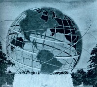
The concept had called for Unisphere to rotate
on its base but that scheme was deemed impractical. By the time
the Fair's symbol was announced, water jets obscured the base
so that Unisphere would appear to "float" above
its reflecting pool. The Equator and Tropic rings were obviously
larger than the other latitudes. Lights whirled about the orbitals. |
Refined, 1961
|
|
|
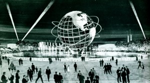
By 1961 the design had been modified to one
much closer to the armillary sphere that was eventually constructed.
A tripod base supports the structure in a large, circular pool
and fountains placed away from the base rise and fall in a circular
pattern suggesting movement. Special lighting effects also suggest
movement. |
Clarke & Rapuano's concept of the Main
Mall
|
|
|
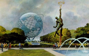
Clarke and Rapuano's
gorgeous concept artwork appeared in 1962. Looking up the Fair's
Main Mall from the Court of the Astronauts to Unisphere, this
artwork is the closest concept of what the Main Mall and Unisphere
would eventually look like when the Fair opened in 1964. The
Clarke and Rapuano artwork served as the basis for the
Postal Department's commemorative stamp issue for the Fair. |
Evolution
of the Fair's Logo
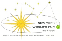
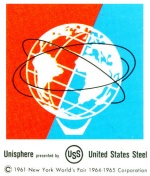
The New York World's Fair logo
changed as the design of Unisphere was refined. Prior to Unisphere
being selected as the Theme Center, the Fair utilized an orbiting
earth and "Big Dipper" logo to represent "Man's
Achievements in an Expanding Universe," one of the oft-repeated
themes of the Fair. After Unisphere was announced as Theme Center
the logo, used between 1961 and late 1962, reflected the design
of the symbol as conceived; Unisphere appears with no base and
actual satellites orbit it. The final logo depicted a stylized
Unisphere as it would appear at the Fair, complete with a base
and simple orbit rings.
Logo, c. 1960
 |
|
Logo, c. 1961-1962
|

|
|
Logo, c. 1963-1972
|
|
|
|
Evolution
of Pavilion Designs
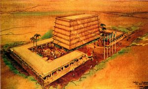
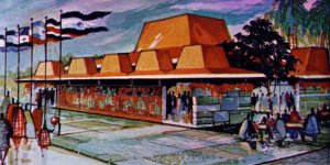
More than 160 fabulous structures rose
from the grounds of Flushing Meadow Park between 1962 and 1964.
The pavilions that hosted millions of visitors at the Fair were
often not the same structures that had been originally conceived.
Budget cutbacks, impracticalities and relocation to other sites
on the Fairgrounds resulted in numerous changes. Some pavilions
were dramatically different from the architect's original
conception.
|
Panama - Panama and Central America
-
Proposed Design
-
-
SOURCE: NY World's
Fair Progress Report No. 4
-
January 17, 1962
 |
|
-
Final Design
-
-
SOURCE: NY World's
Fair Progress Report No. 9
-
September 26,
1963
 |
|
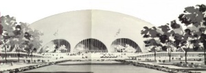
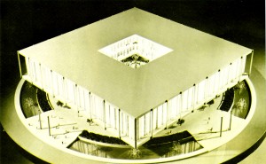
Federal Pavilion
- The New York World's Fair Corporation
had hoped that the Federal Government would construct a major
science pavilion for the Fair. To be called the Franklin National Center of Science and Education,
the huge circular domed building would have occupied all of Kennedy
Circle. The eventual design was called the "square doughnut."
-
-
-
Proposed Design
-
-
Source: US World's
Fair Commission Report, December 1960
|
|
|
-
Final Design
-
-
SOURCE: NY World's
Fair Progress Report No. 7
-
January 24, 1963
|
|
|
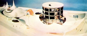
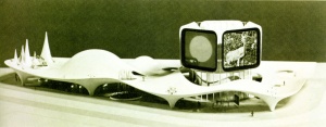
Eastman Kodak
-
Proposed Design
-
-
SOURCE: NY World's
Fair Progress Report No. 5
-
May 17, 1962
 |
|
-
Final Design
-
-
SOURCE: NY World's
Fair Progress Report No. 7
-
January 24, 1963
 |
|
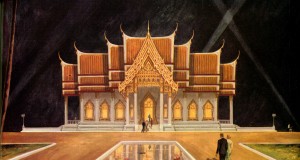
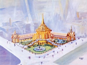
Thailand
-
Proposed Design
-
-
SOURCE: NY World's
Fair Progress Report No. 6
-
September 12,
1962
 |
|
-
Final Design
-
-
SOURCE: NY World's
Fair Progress Report No. 7
-
January 24, 1963
 |
|
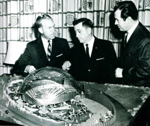
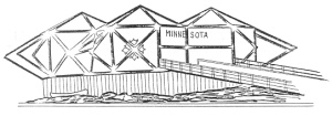
Minnesota
-
Proposed Design
-
-
SOURCE: NY World's
Fair Progress Report No. 8
-
April 22, 1963
 |
|
-
Final Design
-
-
SOURCE: NY World's
Fair Operations Manual
 |
|
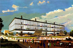
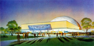
Transportation and Travel
-
Proposed Design
-
-
SOURCE: NY World's
Fair Progress Report No. 4
-
January 17, 1962
 |
|
-
Final Design
-
-
SOURCE: NY World's
Fair Progress Report No. 7
-
April 22, 1963
 |
|
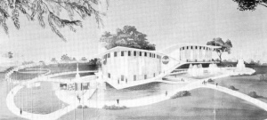
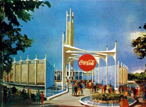
Coca-Cola
-
Proposed Design
-
-
SOURCE: NY World's
Fair Progress Report No. 2
-
May 8, 1961
 |
|
-
Final Design
-
-
SOURCE: NY World's
Fair Progress Report No. 9
-
September 26,
1963
 |
|
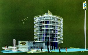
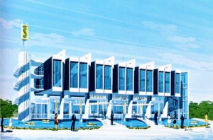
Simmons Beautyrest Pavilion
-
Proposed Design
-
-
SOURCE: NY World's
Fair Progress Report No. 4
-
January 17, 1962
 |
|
-
Final Design
-
-
SOURCE: NY World's
Fair Progress Report No. 7
-
April 22, 1963
 |
|
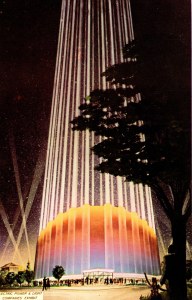
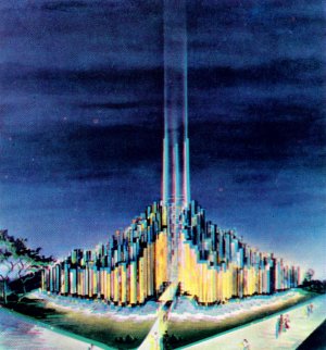
Electric Companies - "Tower
of Light"
-
Proposed Design
-
-
SOURCE: NY World's
Fair Progress Report No. 4
-
September 14,
1961
 |
|
-
Final Design
-
-
SOURCE: NY World's
Fair Progress Report No. 5
-
May 17, 1962
 |
|
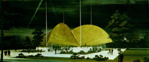
Wisconsin
-
Proposed Design
-
-
SOURCE: NY World's
Fair Progress Report No. 9
-
September 26,
1963
 |
|
-
Final Design
-
-
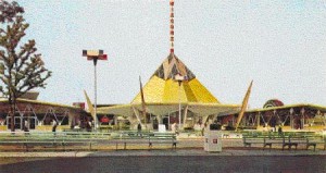
Source: PRUDEN
PRODUCTS CO., Evansville, Wisconsin, advertising copy
 |
|
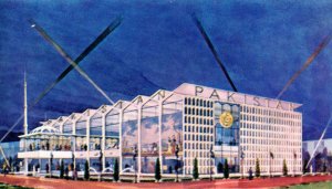
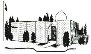
Pakistan
-
Proposed Design
-
-
SOURCE: NY World's
Fair Progress Report No. 7
-
April 22, 1963
 |
|
-
Final Design
-
-
SOURCE: NY World's
Fair Progress Report No. 9
-
September 26,
1963
 |
|
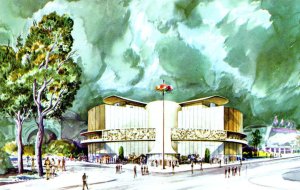
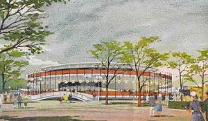
DuPont
-
Proposed Design
-
-
SOURCE: NY World's
Fair Progress Report No. 4
-
September 14,
1961
 |
|
-
Final Design
-
-
Source DuPont
Magazine, March-April, 1964,
-
Volume 58, No.
2
 |
|
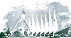
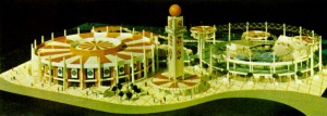
Florida
-
Proposed Design
-
-
SOURCE: NY World's
Fair Progress Report No. 5
-
May 17, 1962
 |
|
-
Final Design
-
-
SOURCE: NY World's
Fair Progress Report No. 9
-
September 26,
1963
 |
|
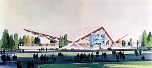
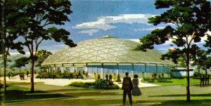
World's Fair Assembly Pavilion
-
Proposed Design
-
-
SOURCE: NY World's
Fair Progress Report No. 7
-
April 22, 1963
 |
|
-
Final Design
-
-
SOURCE: NY World's
Fair Progress Report No. 9
-
September 26,
1963
 |
|
Gas Companies
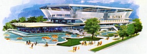
- The original design of the Gas
Companies Pavilion called for glass curtains to extend from the
top of the parasol to the second level. Economics predicated
that this be changed to air curtains.
-
-
-
Proposed Design
-
-
SOURCE: NY World's
Fair Progress Report No. 8
-
April 22, 1963
 |
|
-
Final Design
-
-
Source: Commercial
Transparency by Photo Lab, Inc.,
-
Washington, DC
|

|
|
Liebmann Breweries - Rheingold
Beer
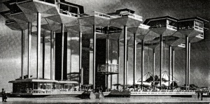
- The original design of the Rheingold
Pavilion, by architects Kahn and Jacobs, featured a 60-foot-high
beer garden atop concrete stilts and platforms supported by cantilevered
aluminum trusses. A glass-walled elevator took visitors from
the ground level to the platforms of the $2 million structure.
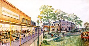
They "Gay-nineties" street scene that was constructed
was, perhaps, a bit more inviting.
-
-
-
Proposed Design
-
-
SOURCE: Unknown,
contribution of John Loughead
 |
|
-
Final Design
-
-
SOURCE: NY World's
Fair Progress Report No. 8
-
April 22, 1963
|
|
|
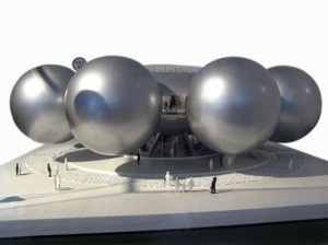
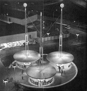
Westinghouse
- Corporate design pioneer Eliot
Noyes championed the integration of architecture, branding, and
graphic design. Beginning in 1960, he was retained by Westinghouse
to remake their corporate identity, and this model shows the
first iteration of the company's pavilion for the 1964 New York
World's Fair.
-
- The building is designed to
contain eight major exhibits, each contained in a globe forty-five
feet in diameter. The eight spheres surround a central lobby,
and moving sidewalks carry the viewer from one exhibit to another.
For reasons of economy, this scheme was not built.
-
-
-
Proposed Design
-
-
SOURCE: ©
Eliot Noyes Industrial Design
 |
|
-
Final Design
-
-
SOURCE: NY World's
Fair Progress Report No. 8
-
April 22, 1963
|
|
|
|
|